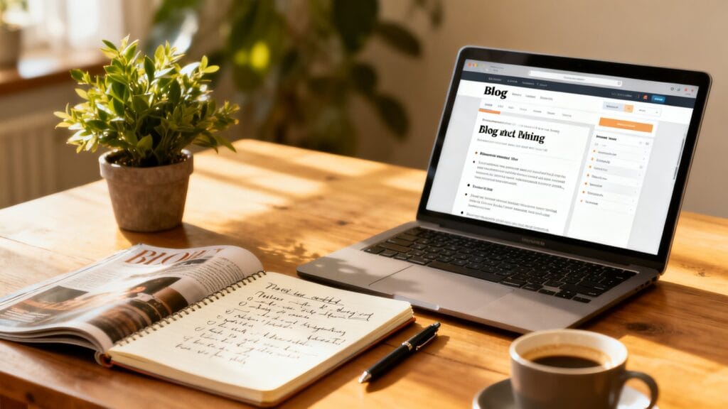
Why Blog Design Matters More Than You Think
If your posts are strong but conversions are flat, your layout may be the culprit. This guide walks through the top Blog Design Mistakes to Avoid for a High-Converting Site, with practical fixes you can apply today. You’ll learn how to streamline navigation, structure content for clarity, and remove conversion roadblocks—without turning your blog into a sales page.
1) Confusing Navigation and Header Clutter
Visitors decide in seconds whether to stay or bounce. A crowded header with too many menu items, social icons, and pop-ups creates friction. When people don’t know where to click, they leave—or miss the next step you want them to take.
Prioritize the paths that matter most. For most blogs, those are: Categories, About, Start Here, and a clear Subscribe or Resources page. Everything else can go in the footer.
How to fix it
- Limit your main menu to 5-7 items. Combine overlapping pages (e.g., merge “Work With Me” and “Services”).
- Create a “Start Here” page highlighting your best posts and your primary opt-in.
- Move social icons to the footer. Keep the header focused on navigation and one key CTA.
- WordPress path: Appearance → Menus. Use “Menu Structure” to reorder and nest items logically.
Realistic note: I once had “Blog,” “Articles,” and “Latest” in the same menu. Users clicked randomly, skimmed, and left. After merging into one “Blog” link and adding a “Start Here” page, email sign-ups improved without any traffic increase.
2) Walls of Text and Poor Content Hierarchy
A high-converting blog is easy to scan. If your posts are long blocks with no subheadings, few paragraphs, and no visual cues, readers struggle to find what they need. Confusion kills conversions because people won’t reach your call to action.
Think of every post like a guided tour. Subheadings provide landmarks, bullets are pit stops, and short paragraphs keep the pace comfortable.
How to fix it
- Use H2s for main sections, H3s for subpoints. Keep paragraphs to 2-4 sentences.
- Add a short summary or key takeaway box near the top. In WordPress, insert a reusable block or group block with a shaded background.
- Turn lists, steps, and comparisons into bullets. Avoid dense, unbroken text.
- Use a table of contents plugin (e.g., Easy Table of Contents) for longer guides. Place it after the intro.
Formatting is not just about looks—it directly affects how quickly readers reach the value they came for, which primes them to take the next step.
3) Weak or Competing Calls to Action
Another common Blog Design Mistakes to Avoid for a High-Converting Site is burying your call to action or presenting too many. When every button is a different color and each section asks for something new, visitors tune out.
Decide the one action you want per post: subscribe, download, start a trial, or book a call. Then support it with context and timing.
How to fix it
- Choose one primary CTA per post, plus a gentle secondary action in the footer if needed.
- Place CTAs where intent is highest: after the intro (soft), mid-article (contextual), and post conclusion (strong).
- Style: One button color site-wide for primary CTAs. Use a muted outline or link style for secondary actions.
- WordPress path: Appearance → Customize → Colors to set consistent button colors. Use Global Styles if your theme supports it (Appearance → Editor).
Example: In a “how-to” post, the mid-article CTA might be “Download the checklist mentioned in Step 3,” then the final CTA asks for a newsletter signup to receive the full toolkit.
4) Inconsistent Typography and Poor Readability
Readability issues—tiny font sizes, low contrast, and cramped line spacing—are silent conversion killers. If reading strains the eyes, people won’t finish the post, let alone click your offer.
Prioritize comfort. Good design here is invisible: content should feel effortless to consume on desktop and mobile.
How to fix it
- Body font size: 16-18px minimum on desktop. Line height: 1.6-1.8. Paragraph spacing: at least 12-16px.
- Contrast: Aim for WCAG AA. Use a tool like WebAIM Contrast Checker to test text against your background.
- Limit to 2 fonts: one for headings, one for body. Avoid decorative fonts for paragraph text.
- Set responsive sizes. In WordPress block themes: Appearance → Editor → Styles → Typography. In classic themes: Customize → Typography or Additional CSS.
Small changes add up. Bumping body text from 14px to 17px and slightly increasing line height can reduce bounce and increase time on page—two metrics strongly correlated with conversions.
5) Slow Pages and Heavy Media
Speed is a design decision. Oversized images, bloated plugins, and auto-play videos cause lag, especially on mobile. Readers won’t wait for hero images and sliders to load before they even reach your headline.
Focus on lean assets and fewer moving parts. Fast pages feel modern, professional, and trustworthy.
How to fix it
- Compress and resize images. Use WebP format where possible. Aim for 1200px max width for blog images.
- Lazy-load below-the-fold media. WordPress does this by default for images; ensure no plugin disables it.
- Audit plugins quarterly. Remove or replace heavy sliders, page builders you don’t use, and overlapping SEO or social plugins.
- Use a caching/performance plugin (e.g., WP Rocket, LiteSpeed Cache). Enable page caching, minify CSS/JS, and defer non-critical scripts.
- Test with PageSpeed Insights. Prioritize “Largest Contentful Paint” and “Total Blocking Time.”
A realistic mistake: Adding three analytics tools and two social share suites for “future insights.” The site slowed down, and engagement dropped. After removing duplicates and using a single lightweight share plugin, pages loaded faster and scroll depth improved.
6) Neglecting Mobile and Thumb-Friendly Design
Most blogs now see a majority of traffic from phones. If buttons are too small, forms are cramped, and pop-ups cover content, you’ll lose mobile readers fast.
Think in thumbs: primary actions within easy reach, plenty of white space, and no pinching-to-zoom.
How to fix it
- Use a sticky but minimal mobile header with a hamburger menu, site logo, and a single CTA if space allows.
- Set tap targets to at least 44x44px. Space links in lists so users don’t tap the wrong one.
- Test forms with your own phone. If typing feels fiddly or labels jump around, simplify fields and enable auto-complete.
- WordPress path: Customize → Additional CSS to increase button padding and line spacing on smaller viewports with @media queries if your theme lacks controls.
- In Google Analytics, compare mobile vs. desktop bounce rate and conversion. If mobile lags significantly, prioritize mobile fixes.
7) SEO and Accessibility Overlooked in the Layout

Design choices affect discoverability and inclusivity. Missing heading structure, weak internal linking, and inaccessible color choices hold back both rankings and conversions. Users who can’t navigate easily won’t convert, and search engines reward clarity.
How to fix it
- Use one H2 per major section and keep headings descriptive (e.g., “Choose the Right CTA Placement,” not “Tips”).
- Build internal links within relevant sentences. Link new posts to 3-5 older, related posts and vice versa.
- Add descriptive alt text to images that convey meaning. Skip alt text for purely decorative images.
- Use breadcrumbs for orientation. Many SEO plugins (Yoast, Rank Math) offer breadcrumb blocks or shortcodes.
- Check keyboard navigation: Can you tab through menus and forms? If not, fix focus states and skip links.
When your structure is accessible and logical, users stay longer, search crawlers understand your content, and your conversion CTAs appear in the right context.
Putting It All Together: A Simple Blog Post Template

Here’s a quick structure you can replicate for most articles to avoid the biggest pitfalls:
- Short intro: State the reader’s problem and the result they want.
- Table of contents: Auto-generated.
- Sectioned content: H2s with 2-4 sentence paragraphs and bullets.
- Contextual mid-article CTA: Related to the section’s topic.
- Summary box: Key takeaways or a checklist.
- Final CTA: One clear action aligned with the post.
In WordPress, save this as a Reusable Block or Pattern so every new post starts with strong structure and consistent CTAs.
Quick Checklist: Blog Design Mistakes to Avoid for a High-Converting Site
- Navigation is simple: 5-7 items, Start Here page, one header CTA.
- Readable text: 16-18px body, high contrast, 1.6-1.8 line height.
- Clear hierarchy: H2/H3 structure, short paragraphs, table of contents.
- Single primary CTA per post with consistent styling and placement.
- Optimized performance: compressed images, caching, minimal plugins.
- Mobile-first: large tap targets, no invasive pop-ups, thumb-friendly layout.
- SEO/accessibility: descriptive headings, internal links, alt text, breadcrumbs.
Conclusion: Design for Clarity, Then Conversion
Great content needs a clear path to action. By focusing on the Blog Design Mistakes to Avoid for a High-Converting Site—confusing navigation, poor hierarchy, weak CTAs, readability issues, slow pages, mobile friction, and ignored accessibility—you create a smoother experience that naturally increases sign-ups, clicks, and sales.
Start with one or two quick wins, like simplifying your menu and standardizing CTA styles. Then improve typography and page speed. With each small fix, your blog becomes easier to use—and higher converting—without sacrificing the human tone readers come for.
Frequently Asked Questions
Visitors judge your site within seconds, and a confusing layout creates friction that leads to bounces. Clear structure and navigation guide readers to the next step, turning attention into action.
Crowded headers with too many menu items, social icons, and pop-ups overwhelm visitors. When users can’t quickly find key paths like Categories, About, or Subscribe, they leave or miss conversion opportunities.
Aim for 5–7 top-level items to keep decisions simple. Consolidate overlapping pages and move lower-priority links to the footer to reduce clutter.
Highlight Categories, About, Start Here, and a clear Subscribe or Resources page. These routes help new and returning readers quickly find value and take the next step.
Group related links into dropdowns, remove redundant icons, and limit pop-ups to key moments. Keep primary actions visible while relocating secondary links to the footer.